Move beyond guesswork and fleeting trends. Discover how to intentionally harness color’s profound psychological impact to shape rest, focus, connection, and joy in every space you inhabit—grounded in environmental psychology and actionable design strategy.
Color is never merely decorative. It is a silent architect of human experience, operating beneath conscious awareness to influence physiological responses, emotional states, and social dynamics within the walls of your home. While a vibrant crimson might energize a creative studio, that same hue in a bedroom could disrupt restorative rest. A cool, misty gray may feel serene in a sun-drenched bathroom but induce unease in a north-facing hallway with limited natural light. This intricate relationship between pigment, perception, and purpose is precisely where intentionality transforms living spaces. Drawing upon established principles in environmental psychology—including peer-reviewed research on color and human response published in the Journal of Environmental Psychology and cross-cultural design analyses—this guide translates nuanced concepts into a clear, room-specific framework. You’ll move beyond generic “blue for calm” advice to understand why certain shades support specific intentions, how lighting and architecture alter their impact, and when to adapt recommendations to your unique physiology, cultural background, and daily rhythms. This is not about rigid rules, but about cultivating awareness—the kind that empowers you to choose colors that actively support how you want to live, feel, and thrive.
Introduction: Why Your Walls Speak Louder Than You Think
Imagine walking into two identical rooms. One is painted a soft, warm greige; the other, a stark, cool white. Without changing a single piece of furniture, which space feels more inviting for conversation? Which might create subtle tension? This immediate reaction isn’t imagination—it’s neurobiology. When light reflects off a colored surface, it enters our eyes and influences signals to the hypothalamus, a region involved in regulating circadian rhythms and stress responses. Simultaneously, emotional and memory centers activate, linking color to personal history, cultural context, and primal associations. Research observing physiological markers indicates that environments with warm, earth-influenced palettes often correlate with reduced self-reported stress compared to spaces dominated by highly saturated or cool-toned schemes under identical conditions. This isn’t solely about subjective preference; it reflects measurable patterns in human-environment interaction.
Yet, mainstream color advice frequently overlooks critical nuance. Articles proclaiming “green is calming” rarely distinguish between a murky olive that may evoke dampness and a vibrant sage that signals renewal. Recommendations for “energizing yellow kitchens” seldom address how a highly saturated lemon hue under harsh lighting might increase visual strain for sensitive individuals. This gap between oversimplified lists and lived reality creates frustration. You’ve likely stood in a paint aisle, overwhelmed by countless options, wondering: Will this actually make my small room feel more spacious? Could this shade affect my evening wind-down routine? How do I choose when household members have different needs? These are valid considerations. Your home is your primary environment for restoration, connection, and personal expression. The colors within it form a continuous, subtle dialogue with your well-being. This guide exists to replace uncertainty with clarity. We’ll move systematically through each room of your home, examining the interplay of psychological intent, physical constraints (light, size, architecture), and deeply personal factors. You’ll gain a repeatable methodology—not just a list of “best colors”—so you can confidently select hues that serve your life. This approach respects color psychology as a dynamic field of study, acknowledging that the most supportive color harmonizes with your space, your light, and your lived experience.
The Intentional Color Framework: Purpose, Perception, Personalization
Before selecting a single paint chip, establish a decision-making foundation. The Intentional Color Framework transforms overwhelming choice into a structured, three-layer process. This methodology reduces decision fatigue, prevents mismatched choices, and ensures every color decision serves a clear purpose. It moves beyond “I like this shade” to “This shade actively supports the primary function and emotional goal of this space.” Apply these layers sequentially for any room, renovation, or accent wall.
Layer 1: Define the Room’s Core Purpose and Desired Emotional Outcome
Begin with function and feeling. For the room in question, answer these two questions with specificity:
- What is the PRIMARY activity performed here? (Be precise: Not just “sleeping,” but “unwinding after screen use,” “reading physical books,” “managing chronic pain rest.” Not just “cooking,” but “preparing quick weekday meals,” “hosting collaborative weekend brunches.”)
- What is the SINGLE MOST IMPORTANT emotional state you want to cultivate upon entering this space? (Choose one dominant feeling: Deep restoration? Focused productivity? Lively connection? Creative flow? Calm neutrality? Joyful energy?)
This clarity is essential. A home office used for detailed analytical work requires a different emotional outcome (calm focus) than one used for brainstorming (creative stimulation). A shared bedroom needs a color supporting mutual rest. Environmental psychology research consistently shows that aligning environmental cues with intended activities enhances comfort and perceived functionality. Your home deserves this same intentionality. Write down your two answers. They become your anchor, filtering every subsequent decision. If a paint sample doesn’t support your defined purpose and emotional goal, it’s not the right choice for this room—regardless of trends.
Layer 2: Analyze Physical Perception Factors (Light, Size, Architecture)
Color does not exist in isolation. Its appearance and impact are dramatically altered by the room’s physical reality. Ignoring this layer is a common source of disappointment. Conduct a 48-hour light observation before finalizing any shade:
- Natural Light Direction & Quality:
- North-Facing Rooms: Receive cool, consistent, shadowy light. Consideration: Colors may appear cooler or duller. Approach: Lean toward hues with warm undertones. Choose creams over stark whites, warm taupes over cool grays. Avoid cool pastels—they may look washed out.
- South-Facing Rooms: Flooded with warm, golden light. Consideration: Colors appear brighter and warmer. Approach: Cooler tones (soft blues, greens, true grays) often balance well. Deep, saturated colors hold up effectively. Avoid overly warm yellows—they may feel intense at midday.
- East-Facing Rooms: Warm morning light shifts to cooler tones by afternoon. Consideration: Color appearance changes throughout the day. Approach: Test samples extensively at different times. Warm neutrals (beiges, greiges) offer versatility. Soft blues or greens can feel refreshing in morning light.
- West-Facing Rooms: Cool morning light transforms into intense, warm glow in late afternoon. Consideration: Significant color shift between morning and evening. Approach: Warm neutrals or earthy tones harmonize with evening warmth. Cool grays may appear muddy as sunlight sets.
- Artificial Lighting Temperature: Note your bulb color temperature (measured in Kelvin):
- 2700K-3000K (Warm White): Adds yellow/red tones. Enhances warm colors; softens cool colors. Ideal for living rooms, bedrooms.
- 3500K-4100K (Neutral White): Balanced light. Reveals color more accurately. Common in kitchens, bathrooms, offices.
- 5000K+ (Daylight): Bluish, stark light. Can alter warm colors; intensifies cool colors. Best reserved for task lighting only.
- Critical Step: Paint large (2’x2′) samples of your top contenders on multiple walls. Observe them at dawn, noon, dusk, and under your room’s actual artificial lighting at night. Live with the samples for 2-3 days. Does the color feel consistent with your Layer 1 goal throughout these shifts?
- Room Size, Ceiling Height, and Architecture:
- Small/Dark Rooms: Light, cool-leaning colors (pale blues, soft greens, warm whites) can create an illusion of expanded space. Generally avoid dark, saturated colors on all walls—they absorb light. Exception: A single darker accent wall opposite the main light source may add depth.
- Large/Bright Rooms: Deeper, warmer, or saturated colors can add coziness and intimacy, preventing a cavernous feel. They advance visually, making walls feel closer. Ideal for vast open-plan areas needing definition.
- Low Ceilings: Paint ceilings a shade lighter than walls, or use a very pale version of the wall color. Vertical elements draw the eye upward. Generally avoid dark ceilings—they can feel heavy.
- High Ceilings: Painting the ceiling a slightly deeper shade than the walls (or using a warm neutral) can lower the perceived height and add warmth. Crown molding painted the wall color minimizes height.
- Awkward Layouts: Use color to guide the eye. Paint a narrow hallway a light, cool-leaning color to enhance perceived length. Define a seating area within a large room with a slightly deeper shade on those walls.
Layer 3: Personalize with Meaningful Connections and Practical Constraints
This layer honors your unique context. Psychology provides patterns, but you are the variable. Integrate these deeply personal considerations:
- Cultural and Personal Associations: Red signifies celebration in many East Asian cultures but urgency in some Western contexts. For you personally, does lavender evoke cherished memories or a clinical setting? Does forest green feel grounding or oppressive? Journal honestly. If a color recommended for calm triggers a negative personal association, it will not serve you, regardless of general research. Your lived experience is paramount.
- Existing Fixed Elements: Acknowledge non-negotiables before choosing paint:
- Flooring: Is your hardwood warm (honey oak) or cool (gray-washed)? Tile color? Carpet?
- Countertops/Stone: Veining contains multiple colors. Pull your secondary or tertiary color from these elements for harmony.
- Large Furniture: A cherished antique armoire, built-in bookshelves, or a sofa you won’t replace soon.
- Approach: Collect physical samples (fabric swatches, tile chips, wood scraps). Lay them next to your paint samples under room lighting. Does the combination feel cohesive?
- Household Members’ Needs: Consider neurodiversity, age, and sensitivities:
- Sensory Sensitivity (Autism, ADHD, Anxiety): Highly saturated colors, stark contrasts, or complex patterns can be overstimulating for some. Prioritize muted, low-contrast palettes (soft clay, warm oat, dusty sage). Matte or eggshell finishes reduce visual glare better than gloss.
- Children’s Spaces: Avoid gendered clichés. Consider developmental stages. Infants respond to high-contrast patterns but need calm for sleep. Toddlers benefit from clear visual zones. School-aged children may appreciate a color reflecting interests, but avoid overly stimulating hues near beds. Involve them in choosing within your curated, psychologically supportive options.
- Elderly Residents: Aging eyes perceive color differently—contrast becomes crucial for safety (e.g., light switch plate against a wall). Ensure adequate lighting. Warm, familiar neutrals often feel most secure.
- Maintenance and Lifestyle: A matte finish hides wall imperfections but is harder to clean. Satin or semi-gloss is durable for high-touch areas (hallways, kids’ rooms, kitchens) but highlights surface texture. If you have young children or pets, prioritize washable finishes and colors that camouflage minor marks (warm mid-tones like clay or olive often hide scuffs better than stark white or deep charcoal).
The Fundamental Principle: The most supportive color for your home is not the one trending online, nor the one deemed “universally calming” by a single study. It is the color that successfully harmonizes the room’s intended purpose (Layer 1), respects the physics of your space (Layer 2), and resonates authentically with your personal history, cultural context, and daily reality (Layer 3). This triad transforms color from a decorative afterthought into a purposeful element of well-being.
Room-by-Room Application of the Framework
Now, we apply the Intentional Color Framework to specific home contexts. For each room, we define the core psychological goal, translate it into actionable strategies with illustrative examples (including widely available paint references for clarity), address critical lighting and architectural considerations, highlight common considerations, and offer adaptable solutions. Remember: these are starting points. Always filter through your Layers 1, 2, and 3.
The Living Room: Cultivating Connection and Calm
The living room often serves as the emotional heart of a home—a space for connection, relaxation, and transition. Its primary psychological goal is typically balanced sociability: fostering warmth for conversation while providing visual calm for rest. It must feel welcoming to guests yet deeply restorative for residents. This dual purpose demands nuance.
Psychological Strategy & Color Palette: Avoid extremes. Highly saturated reds or oranges may feel overwhelming for prolonged relaxation. Stark whites or cool grays can feel sterile for connection. The sweet spot lies in warm, muted mid-tones and soft neutrals that feel grounded yet inviting. These hues support ease without inducing drowsiness.
- Top Recommendations (with Rationale):
- Warm Greige (e.g., Sherwin-Williams “Agreeable Gray” SW 7029, Benjamin Moore “Revere Pewter” HC-172): A balanced bridge between gray and beige. It feels sophisticated yet cozy, providing a serene backdrop that allows furniture, art, and people to be the focus. Why it works: Subtle warmth evokes earth and comfort; the gray component adds modern restraint, reducing visual noise.
- Soft Clay/Terracotta (e.g., Farrow & Ball “Jitney” No. 221, Sherwin-Williams “Cavern Clay” SW 7701): Evokes sun-baked earth and pottery. Radiates inherent warmth and organic authenticity. Why it works: Earth tones signal stability and shelter. A muted clay provides warmth without the agitation potential of pure red. Pairs beautifully with natural textures (wood, linen, rattan).
- Dusty Sage Green (e.g., Benjamin Moore “October Mist” 1495, Sherwin-Williams “Sage Green Light” SW 2851): A gentle nod to nature. Promotes a sense of renewal and quiet optimism. Why it works: Green sits near the center of the visible spectrum, requiring minimal eye adjustment. Sage carries connotations of balance, reducing subconscious tension.
- Deep, Muted Navy (e.g., Sherwin-Williams “Naval” SW 6244, Farrow & Ball “Hague Blue” No. 30): For larger living rooms needing intimacy or a sophisticated accent wall. Not a bright royal blue. Feels enveloping and calmly authoritative. Why it works: Associated with twilight skies, it encourages introspection. Use on a single feature wall behind a sofa or fireplace. Crucial: Balance with ample warm lighting (2700K bulbs) and textured neutrals (cream rug, wood tones) to prevent coolness.
Lighting & Architecture Considerations:
* Low Light/Large Room: Lean toward warmer options—Revere Pewter over a cooler gray. Avoid deep navy on all walls; use sparingly as an accent. Maximize reflective surfaces: light-colored furniture, mirrors opposite windows.
* Abundant South Light: Cooler-leaning options like a true soft gray (Sherwin-Williams “Repose Gray” SW 7015) or dusty sage often work well. The warm sunlight prevents them from feeling cold. Deep navy also holds up beautifully here.
* Open Floor Plan: Use color to define zones. Paint the living area walls a distinct (but harmonious) shade from adjacent areas. For example, living room in Agreeable Gray, dining nook in slightly warmer Revere Pewter. Ensure colors share an undertone (both warm) for flow.
* Small Living Room: Stick to light, warm neutrals (creams, very light greiges). Avoid dark colors on all walls. If craving depth, use a medium-tone clay or sage on one accent wall, keeping other walls light.
Common Considerations & Solutions:
* Consideration: A beige that looks pink or yellow under specific lighting. Solution: Test large samples. Hold pure white paper next to the sample to reveal undertones. In north light, avoid beiges with strong pink undertones—they may look muddy.
* Consideration: Using a single flat color throughout a large, multi-functional space, making it feel monotonous. Solution: Introduce subtle variation. Paint the ceiling a shade lighter. Use a slightly deeper tone on built-ins or an alcove. Layer textiles (rugs, throws) in complementary hues.
* Consideration: Large-screen TVs creating visual contrast on light walls. Solution: If the TV is a focal point, consider a slightly deeper wall color behind it (like Hague Blue) to minimize contrast, or use bias lighting behind the TV to reduce eye strain.
Adaptable Solutions:
* For Active Households: Prioritize durable, washable satin finish. Choose colors with inherent “camouflage” properties—warm mid-tones like clay hide minor scuffs better than pure white. Incorporate color through easily changeable textiles.
* For Sensory Sensitivity: Opt for a muted, low-contrast palette. A soft, warm oat color (Benjamin Moore “Manchester Tan” HC-81) on walls with cream trim creates a calming envelope. Avoid high-gloss finishes; choose matte. Minimize pattern on large surfaces; use texture (nubby wool rug, linen curtains) for visual interest.
* Budget-Friendly Approach: Paint just the accent wall behind the main seating area in your chosen deeper hue. Keep other walls a versatile, light warm neutral. Update throw pillows, a large area rug, and artwork to pull the accent color through the room cohesively.
The Kitchen: Energizing Efficiency and Warmth
The kitchen is a complex environment demanding focused energy for tasks while fostering warmth for connection. It’s a workspace and a social hub. The goal is a hue that supports gentle alertness without anxiety and radiates welcoming warmth.
Psychological Strategy & Color Palette: Steer clear of extremes. Stark white can feel clinical and highlight every crumb. Deep, saturated colors may feel overwhelming. The ideal palette balances cleanliness, warmth, and subtle stimulation—evoking fresh ingredients, natural light, and hearth-like comfort.
- Top Recommendations (with Rationale):
- Warm White / Cream (e.g., Sherwin-Williams “Alabaster” SW 7008, Benjamin Moore “White Dove” OC-17): Timeless for good reason. Specificity matters: Avoid cool, blue-based whites. Choose whites with warm (yellow/red) or greige undertones. Alabaster has subtle warmth; White Dove is soft and creamy. Why it works: Light colors maximize perceived space and brightness. Warm undertones prevent a sterile feel, associating the space with comfort and nourishment. They provide a neutral canvas that makes colorful food “pop.”
- Soft Sage Green (e.g., Sherwin-Williams “Sea Salt” SW 6204, Benjamin Moore “Palladian Blue” HC-144 – note: despite name, often reads as a soft green-gray): Evokes fresh herbs and clean water. Why it works: Green is associated with health and nature—powerful cues in a food-prep space. A soft, muted sage reduces eye strain during detailed tasks better than stark white. Feels calming yet refreshing.
- Warm Greige (e.g., Sherwin-Williams “Accessible Beige” SW 7036, Benjamin Moore “Edgecomb Gray” HC-173): For those wanting more depth than white. Creates a grounded, earthy backdrop. Why it works: Warmth feels inherently welcoming. Hides minor smudges better than pure white. Pairs effortlessly with most cabinet colors and countertops. Accessible Beige is exceptionally neutral, minimizing undertone clashes.
- Terracotta / Clay Accent (e.g., Farrow & Ball “Setting Plaster” No. 231, Sherwin-Williams “Canyon Dusk” SW 7711): Use on a single wall (behind stove or sink) or lower cabinets. Why it works: Injects organic warmth and tactile comfort. Signals “hearth” and “nourishment.” Provides gentle stimulation perfect for morning routines. Critical: Keep upper cabinets and other walls light to maintain brightness.
Lighting & Architecture Considerations:
* Task Lighting is Essential: No wall color compensates for poor task lighting over counters. Ensure under-cabinet lighting (2700K-3000K LED strips). The wall color should complement this light—warm whites enhance the cozy glow of 2700K bulbs.
* Small or Windowless Kitchens: Must use light, reflective colors. Warm white (Alabaster) is the safest choice. It maximizes every bit of available light. Avoid medium or dark tones on walls—they absorb light. Use glossy backsplashes to bounce light. Introduce color through durable, replaceable elements: a vibrant runner rug, colorful canisters.
* Galley Kitchens: Painting long walls a light, cool-leaning color (like Sea Salt) can make the space feel slightly wider. Painting the end wall a slightly deeper complementary tone can create a focal point and reduce the “tunnel” effect.
* Open to Living/Dining: Maintain flow. If the adjacent living room is Agreeable Gray, choose Accessible Beige or Edgecomb Gray for the kitchen—colors in the same family but slightly warmer. Avoid stark contrasts unless deliberately using color to define zones with an architectural element.
Common Considerations & Solutions:
* Consideration: Choosing a yellow that reads as sickly under kitchen lighting. Solution: Most yellows are high-risk. If drawn to yellow, opt for an extremely muted, green-based yellow (like Sherwin-Williams “Roycroft Vellum” SW 2833) or use it only in accessories. Warm whites often provide the desired “sunshine” feeling more reliably.
* Consideration: Ignoring cabinet color. Painting walls the exact same color as white cabinets can make the space feel flat. Solution: Choose a wall color slightly warmer (if cabinets are cool white) or slightly cooler (if cabinets are warm wood) to create subtle dimension. Test samples directly next to your cabinet finish.
* Consideration: Forgetting the ceiling. A stark white ceiling against warm walls can feel disjointed. Solution: Paint the ceiling the same warm white as the walls (e.g., Alabaster on walls and ceiling) for a cohesive feel, especially in smaller kitchens.
Adaptable Solutions:
* For Task-Focused Cooking: Prioritize clarity. Warm white walls (Alabaster) with high-quality, shadow-minimizing task lighting are paramount. Introduce subtle color interest through a textured backsplash or open shelving displaying ceramics. Avoid busy patterns on large surfaces.
* For Family Connection Hub: Embrace warmth. Edgecomb Gray walls with white trim and warm wood accents create an inviting backdrop. Incorporate a chalkboard or magnetic paint wall (in a warm neutral tone) for notes and art—a functional element that adds personality.
* Renter-Friendly Refresh: Focus on textiles and accessories: A warm-toned runner rug (terracotta, ochre) adds grounding energy. Replace cool-white bulbs with 2700K LEDs. Add open shelves with dishes in sage green or creamy white. A large piece of art with warm, earthy tones above the sink can shift the room’s entire feel. Removable wallpaper on the backsplash area (in a subtle clay pattern) is a powerful, reversible option.
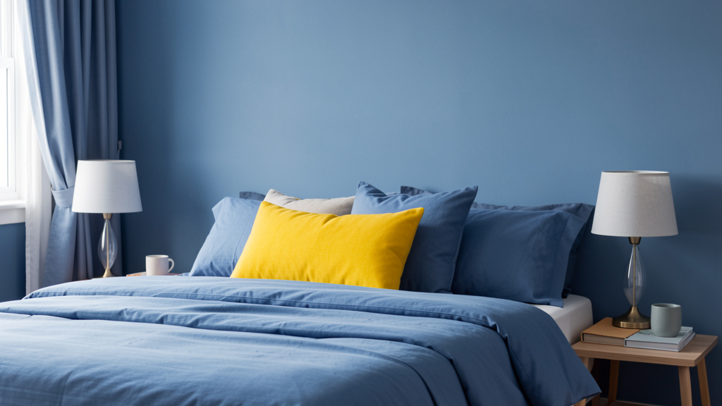
The Bedroom: Engineering Deep Restoration and Serenity
The bedroom’s core purpose is physiological and psychological restoration. This is where the body repairs itself and stress must dissolve. Every color choice must support this singular goal: promoting conditions conducive to restful sleep. This is not the room for bold statements or high-energy hues. The priority is creating a sanctuary that facilitates the transition from wakefulness to deep rest.
Psychological Strategy & Color Palette: Research consistently points to cool, muted, low-saturation colors as supportive for sleep environments. However, “cool” does not mean “cold.” The key is muted cool tones with subtle warmth or earthiness to prevent sterility. Avoid bright, saturated, or strongly warm hues (reds, oranges, bright yellows) which may stimulate alertness. Also avoid stark whites, which can feel clinical.
- Top Recommendations (with Rationale):
- Soft, Muted Blue (e.g., Sherwin-Williams “Rainwashed” SW 6211, Benjamin Moore “Palladian Blue” HC-144): A frequently cited supportive choice for rest. Specificity is critical: Avoid bright sky blues. Seek blues with significant gray or green undertones—“dusty,” “misty,” or “powdery” descriptors are clues. Rainwashed is a pale, green-tinged blue. Why it works: Blue is associated with calm, stable elements (sky, sea). Cooler color temperatures may support the body’s natural cooling process before sleep. The muted quality prevents visual overstimulation.
- Dusty Lavender / Mauve (e.g., Sherwin-Williams “Languid Blue” SW 6224 – note: reads as a soft lavender, Farrow & Ball “French Gray” No. 18): A sophisticated alternative, particularly for those who find blue too cool. Why it works: Lavender has documented associations with calm in aromatherapy; this psychological link may carry over visually. A dusty, grayed-out lavender feels serene and gentle. French Gray is a subtle lavender-gray that feels calming and elegant.
- Warm, Muted Green (e.g., Sherwin-Williams “Contented” SW 6198, Benjamin Moore “Saybrook Sage” HC-114): Evokes a shaded forest glade. Why it works: Green is often described as the most restful color for the human eye. A muted, earthy sage promotes feelings of balance and renewal. Contented is exceptionally soft and neutral-leaning, making it a safe, deeply calming choice.
- Warm, Deep Taupe / Greige (e.g., Sherwin-Williams “Worldly Gray” SW 7043, Benjamin Moore “Revere Pewter” HC-172): For those who genuinely prefer warmth. Crucially, this must be a warm, muted neutral—not a beige with strong yellow or pink undertones. Worldly Gray blends gray, beige, and subtle violet. Why it works: Provides the psychological safety of earth tones without potential stimulation of warmer beiges. Feels like a soft blanket—secure and calming. Essential: Pair with very warm (2700K) lighting and textured textiles (linen, wool) to maintain warmth.
Lighting & Architecture Considerations:
* Lighting is Paramount for Rest: Install dimmable lights. Use bulbs no brighter than 2700K (warm white). Critical: Minimize blue-light exposure before bed. Cover LED indicators on electronics. Use blackout curtains—essential for light-sensitive sleepers. The wall color should complement this low-light environment: avoid colors that look muddy in dim light (test samples at night!). Soft blues and lavenders often retain a gentle quality under warm, dimmed lighting.
* Small Bedroom: Light, cool colors (Rainwashed, Contented) make the space feel airy. Avoid dark colors on all walls. If using a deeper tone like Revere Pewter, limit it to an accent wall behind the bed to create a cozy “nesting” effect.
* Large Bedroom / Master Suite: More flexibility. A deeper, muted tone like French Gray or Worldly Gray on all walls can create a profoundly serene, cocooning atmosphere. Ensure ample layered lighting (floor lamps, sconces) to avoid cavernous feelings. A slightly deeper shade behind the bed anchors the space.
* North-Facing Bedroom: Cool blues may feel chilly here. Approach: Lean toward warmer options in the palette. Contented (sage) or Worldly Gray (warm taupe) are often safer. Maximize warmth through lighting (2700K dimmables), textiles (cream wool throw), and potentially a subtle warm undertone in bedding. Test samples rigorously.
Common Considerations & Solutions:
* Consideration: Using a “calming” blue that is too saturated or has a strong green undertone, which can feel cold. Solution: Hold the sample next to a true gray card. If the blue looks vibrant, it’s likely too saturated. Look for blues described as “dusty” or “powdery.” Rainwashed is formulated to be soft.
* Consideration: Painting the entire room, including trim and ceiling, a dark color hoping for coziness. Result: Can feel oppressive. Solution: If craving depth, use a deeper tone only on the wall behind the bed. Keep ceiling and trim a crisp, warm white (like White Dove) to maintain height and light reflection. Use texture (grasscloth wallpaper) for depth without overwhelming darkness.
* Consideration: Ignoring bedding and textiles. A serene blue wall paired with bright white sheets can still feel alerting. Solution: Layer in warmth and softness. Choose bedding in ivory, oat, or light clay. Use wood tones for furniture. Add a textured wool or faux-fur throw. These elements soften the overall impression.
Adaptable Solutions:
* For Rest Challenges or High Stress: Prioritize simplicity. A very soft, muted blue like Rainwashed. Minimize visual clutter—paint walls and large furniture the same muted tone for a seamless envelope. Use blackout curtains and eliminate electronic light sources. Incorporate textured, non-reflective finishes (matte paint, linen bedding) to reduce sensory input. Avoid patterns on walls or large textiles.
* For Couples with Differing Preferences: Find common ground in neutrality. Worldly Gray or Contented are often acceptable compromises—they are calming without being strongly “cool” or “warm.” Focus energy on shared textiles (a rug you both love) and lighting. If one partner prefers warmth, use it strategically: warm wood nightstands, a clay-colored throw pillow. The wall color sets the foundational calm; accents can personalize.
* Children’s/Teen Bedroom: Adapt the principle. For a young child who fears the dark, avoid very dark colors. A soft, warm sage (Contented) or barely-there lavender (Languid Blue) provides calm. For teens craving expression, guide them toward muted versions of their preferred color (dusty rose instead of hot pink). Involve them in choosing bedding within the calming wall framework. Always prioritize low-VOC or zero-VOC paints for children’s rooms.
The Bathroom: Creating a Sanctuary of Renewal and Clarity
The bathroom serves dual functions: private restoration (a personal retreat) and hygienic clarity (a space associated with cleanliness). The ideal strategy balances spa-like serenity with crisp freshness. It must feel both inviting and impeccably sanitary. Humidity, steam, and cleaning add practical constraints.
Psychological Strategy & Color Palette: Lean into colors evoking natural cleansing elements: water, stone, sky, sand. Soft, light neutrals and muted earth tones dominate, with careful attention to undertones to avoid clinical coldness or dated warmth. Avoid very dark colors (cave-like), very bright colors (harsh), or overly saturated hues (chaotic in small spaces).
- Top Recommendations (with Rationale):
- Warm White / Oat (e.g., Sherwin-Williams “Alabaster” SW 7008, Benjamin Moore “White Dove” OC-17, Sherwin-Williams “Oyster Bar” SW 7562): Foundation of successful bathrooms. Critical distinction: Warm whites (Alabaster, White Dove) feel clean yet inviting. Cool whites feel sterile. Oyster Bar is a light, warm greige that adds subtle sophistication and hides minor marks better than pure white. Why it works: Light colors maximize perceived space and brightness. Warm undertones prevent “hospital” associations, linking to clean linen and natural light.
- Soft, Muted Green (e.g., Sherwin-Williams “Sea Salt” SW 6204, Benjamin Moore “Palladian Blue” HC-144): The quintessential spa color. Sea Salt is a delicate green-gray, reminiscent of sea glass. Why it works: Green is intrinsically linked to nature and renewal—powerful cues for a personal care space. This muted, watery green feels fresh and calming without being cold.
- Warm Greige / Taupe (e.g., Sherwin-Williams “Accessible Beige” SW 7036, Benjamin Moore “Edgecomb Gray” HC-173): For larger bathrooms where a cozier, grounded feel is desired. Why it works: Evokes smooth river stones and sand—materials associated with natural spas. Feels sophisticated, warm, and stable. Accessible Beige is versatile and minimizes clashing with common tile colors.
- Soft Clay / Terracotta Accent (e.g., Farrow & Ball “Setting Plaster” No. 231): Use sparingly—on a single wall, lower half with wainscoting, or vanity cabinet. Why it works: Injects organic warmth and tactile comfort, signaling “sanctuary.” Grounding and deeply human. Essential: Balance with ample light colors and warm lighting to prevent heaviness.
Lighting & Architecture Considerations:
* Vanity Lighting is Critical: Install sconces flanking the mirror (not just overhead) with bulbs rated 2700K-3000K and high CRI (>90). This ensures skin tones appear natural. The wall color should complement this light—warm whites enhance a healthy glow; avoid cool grays that may make skin look sallow under certain lights. Test your paint sample next to your face in the vanity lighting.
* Small or Windowless Bathroom: Must use light, reflective colors. Warm white (Alabaster) or very light greige (Accessible Beige) on walls and ceiling. Use large-format, light-colored tiles with minimal grout lines. A large mirror opposite the light source amplifies brightness. Avoid medium or dark tones—they absorb limited light. Satin finish paint is often sufficient for durability and light reflection.
* Large Master Bathroom: Opportunity for depth. Paint walls a soft greige (Edgecomb Gray) and ceiling a crisp warm white (White Dove) to maintain height. Use a deeper, muted tone like Setting Plaster on the wall behind the freestanding tub to create a focal point. Incorporate natural materials (teak stool, stone vessel sink).
* High Humidity Areas: Prioritize paint with a semi-gloss or satin finish formulated for bathrooms (mold/mildew resistant). Satin is usually sufficient for most walls and easier to wipe clean. Reserve semi-gloss for trim and splash zones.
Common Considerations & Solutions:
* Consideration: Choosing a beige that clashes with existing beige tile. Solution: Take a tile sample to the paint store. Hold potential paint chips directly against the tile under the bathroom’s actual lighting. Look for a paint color that is a noticeably lighter/darker shade of the same undertone or a complementary neutral. When in doubt, go lighter and warmer.
* Consideration: Using a cool gray with warm wood tones and gold fixtures, creating a disjointed feel. Solution: Match the undertone of your dominant fixed elements. Warm wood and brass fixtures demand warm wall colors (warm white, greige, clay). Cool chrome and gray tile can handle cooler wall tones, but lean toward muted, complex grays with subtle warmth.
* Consideration: Painting the ceiling the same dark color as the walls in a small bathroom, making it feel like a box. Solution: Always paint the ceiling a lighter shade than the walls, ideally a crisp warm white (White Dove). This creates visual height and reflects light downward.
Adaptable Solutions:
* For a True Spa Experience (Master Bath): Create a monochromatic, layered scheme. Walls in Palladian Blue, slightly darker shade on lower wainscoting, light oat-colored floor tile, brushed brass fixtures. Incorporate texture: ribbed tile, teak bath mat, linen shower curtains. The muted green palette anchors deep relaxation.
* For a High-Traffic Family Bathroom: Prioritize durability. Walls in a light, warm greige (Accessible Beige) with a satin finish. Hides minor scuffs better than pure white. Choose a slightly darker grout color matching the tile to minimize visible dirt. Use wipeable wallpaper with subtle texture on the lower half for added durability and visual interest. Keep the palette simple to reduce visual chaos.
* Powder Room Power Play: This small space is ideal for intentional impact. Choose one wall (behind the sink) in a deep, muted hue like Farrow & Ball “Hague Blue” or “Setting Plaster.” Keep other walls and ceiling a crisp White Dove. Creates dramatic impact without sacrificing perceived space. Pair with interesting hardware and a single piece of art. The psychological goal shifts slightly to “memorable welcome.”
The Home Office: Cultivating Focused Clarity and Creative Flow
The home office must support two cognitive states: deep, uninterrupted focus for analytical tasks and open, flexible thinking for creative work. The color strategy must minimize distraction while providing subtle stimulation to maintain engagement. The palette should reflect your specific work style and primary tasks.
Psychological Strategy & Color Palette: Avoid extremes that sabotage productivity. Stark white may induce alertness but also visual fatigue. Dark, saturated colors on all walls can feel oppressive. Bright, saturated colors are highly distracting for focused work. The optimal palette consists of low-saturation, complex neutrals and soft, nature-inspired hues that provide a calm backdrop.
- Top Recommendations (with Rationale):
- For Deep Focus (Analytical Work): Soft, Complex Gray-Greens (e.g., Sherwin-Williams “Intellectual Gray” SW 7045, Benjamin Moore “Gray Owl” OC-51): Not flat, cool grays. Intellectual Gray has a subtle green undertone; Gray Owl blends gray and beige. Why it works: Green is often cited as restful for the eyes, reducing strain during screen time. The muted, complex nature minimizes visual distraction. Feels professional, calm, and grounded, supporting sustained concentration.
- For Creative Flow (Generative Work): Warm, Muted Terracotta or Clay (e.g., Sherwin-Williams “Cavern Clay” SW 7701, Farrow & Ball “Jitney” No. 221): Use on one accent wall (behind the desk) or as the primary wall color in a well-lit space. Why it works: Earthy reds and oranges are linked to energy and warmth—but muted versions provide gentle activation without agitation. Cavern Clay evokes pottery and primal creativity. Feels inspiring and human-centered. Crucial: Balance with ample light neutrals and excellent lighting to prevent heaviness.
- Universal Neutral Base (All Work Types): Warm Greige (e.g., Sherwin-Williams “Agreeable Gray” SW 7029, Benjamin Moore “Revere Pewter” HC-172): The most versatile choice. Creates a serene, professional, and adaptable backdrop. Why it works: Provides calm neutrality for focus while possessing enough warmth to feel inviting. Doesn’t impose a strong psychological bias, allowing you to control the environment’s energy. Pairs effortlessly with most furniture and accent hues.
- Strategic Accent: Deep, Muted Navy (e.g., Sherwin-Williams “Naval” SW 6244): Ideal for a single accent wall behind the monitor or bookshelves. Why it works: Conveys depth and stability. Creates a visually “receding” surface that minimizes distraction from the screen, helping to contain the visual field. Unlike black, muted navy feels sophisticated and calm.
Lighting & Architecture Considerations:
* Task Lighting is Essential: Overhead room lighting is insufficient and causes glare. Use an adjustable desk lamp with a warm-white (2700K-3000K) LED bulb focused on your work surface. Position your monitor perpendicular to windows to avoid screen glare. Avoid highly reflective gloss finishes on walls near the desk that could cause secondary glare.
* Small Office / Closet Conversion: Maximize perceived space and light. Paint all walls and ceiling the same light, warm neutral (Agreeable Gray or Alabaster). Creates a seamless, airy envelope. Use a large mirror strategically to reflect light and create depth. Avoid dark accent walls—they shrink the space visually.
* Room with Abundant Natural Light: More flexibility for deeper colors like Cavern Clay or Naval on an accent wall. Natural light prevents oppressiveness. Position your desk so windows are to the side to control glare. Use adjustable blinds.
* Open-Plan Office (within living area): Use color to define the workspace psychologically. Paint the wall behind your desk a slightly deeper, focused hue (like Intellectual Gray or Naval) while keeping surrounding walls the main living area color. Creates a subtle “zone” that signals “work mode.”
Common Considerations & Solutions:
* Consideration: Painting the wall behind the monitor a bright white or light color, causing visual competition and eye strain. Solution: This is the prime location for a deep, muted accent color like Naval. The darker, receding wall minimizes distraction, making the screen content the clear focal point.
* Consideration: Using a cool, blue-based gray under cool-white office lighting, creating a cold environment. Solution: Match wall undertones to your lighting temperature. For standard office lighting (3000K-3500K), choose grays with warm or green undertones (Intellectual Gray, Gray Owl). Test samples under your actual lights.
* Consideration: Overloading the space with too many competing colors through furniture and accessories. Solution: Adhere to a strict color palette. Choose one primary wall color, one accent wall color (if used), and limit accessories to 2-3 complementary hues. Clutter is a major focus-killer; color calm is undermined by visual chaos.
Adaptable Solutions:
* For Video Calls (Zoom Background): Your wall color is part of your presentation. Avoid stark white (washes you out), busy patterns, or very dark colors. Ideal: A soft, warm neutral like Agreeable Gray or Edgecomb Gray. Provides a clean, professional, non-distracting backdrop. Add subtle texture (a woven wall hanging, floating shelves with minimal books). Test: Do a test call to check appearance.
* For Neurodivergent Focus (ADHD, Autism): Prioritize extreme visual calm. Paint all walls, ceiling, and door the same muted, low-contrast color (e.g., a soft warm oat like Benjamin Moore “Manchester Tan” HC-81). Minimizes visual boundaries and potential sensory triggers. Choose furniture in similar muted tones. Eliminate pattern on large surfaces. Use texture for subtle interest (nubby wool rug, linen curtain). Ensure lighting is dimmable and glare-free. Goal: a seamless, predictable visual field that reduces cognitive load.
* Budget Refresh for Existing Space: Can’t paint? Transform impact strategically:
* For Focus: Hang art with a deep navy or charcoal background behind your monitor. Add a desk lamp with a warm bulb. Place a small plant with green foliage (snake plant, ZZ plant) within sight—studies suggest even small amounts of greenery may reduce stress.
* For Creativity: Drape a terracotta or ochre-colored throw over your chair. Use a vibrant (but not neon) mouse pad. Place inspiring images on a bulletin board with a soft clay background (removable wallpaper squares work well).
The Dining Room: Fostering Connection and Mindful Nourishment
The dining room’s core purpose is to enhance social connection and mindful enjoyment of food. It should encourage lingering conversation, support a healthy relationship with eating, and create a sense of occasion or comfortable ritual. The color must feel welcoming, supportive of digestion (psychologically), and conducive to relaxed interaction.
Psychological Strategy & Color Palette: Warmth is key, but avoid hues that trigger agitation. Steer clear of stark whites (cafeteria-like), cool grays (sterile), and highly saturated reds/oranges (may increase heart rate and signal urgency). The ideal palette features rich, earthy neutrals and deeply muted warm tones that feel abundant, nurturing, and grounded.
- Top Recommendations (with Rationale):
- Deep, Muted Terracotta / Clay (e.g., Sherwin-Williams “Canyon Dusk” SW 7711, Farrow & Ball “Setting Plaster” No. 231): Premier choice for dining rooms. Why it works: Linked to earth, pottery, and hearths. Radiates warmth, comfort, and organic authenticity. Muted earthy reds gently support appetite and conversation without agitation. Canyon Dusk is sophisticated and timeless. Creates an intimate atmosphere that encourages guests to settle in. Pairs beautifully with natural wood tables and candlelight.
- Warm, Rich Greige / Taupe (e.g., Benjamin Moore “Revere Pewter” HC-172, Sherwin-Williams “Worldly Gray” SW 7043): For a subdued, elegant, versatile backdrop. Why it works: Provides sophisticated neutrality that feels warm and inviting. Allows food, tableware, and people to be the stars. Revere Pewter’s subtle complexity adds depth. Feels grounded and stable, promoting calm connection.
- Deep, Muted Olive Green (e.g., Sherwin-Williams “Artichoke” SW 6179, Farrow & Ball “Bancha” No. 29): A sophisticated, nature-inspired alternative. Why it works: Green is associated with growth and harmony—positive cues for nourishment. A deep, earthy olive feels rich and stable. Evokes olive groves and natural abundance. Artichoke is a warm, complex green that feels cozy under candlelight.
- Warm Charcoal (e.g., Sherwin-Williams “Iron Ore” SW 7069): For larger dining rooms where drama and intimacy are desired. Why it works: This is not a cool, blue-based black. Iron Ore is a deep, warm gray with brown undertones. Used on all walls, it creates an intimate, cocooning atmosphere—like a favorite leather armchair. Makes candlelight glow more intensely. Critical: Requires excellent layered lighting (dimmed chandelier, wall sconces, candles) and must be balanced with warm wood tones and light-colored tableware to prevent heaviness. Best for formal dining rooms or evening-focused spaces.
Lighting & Architecture Considerations:
* Lighting is the Soul of the Dining Room: A dimmable chandelier or pendant centered over the table is essential. Use warm bulbs (2700K). Lowering the lights creates intimacy and shifts the psychological state. Wall sconces or buffet lamps provide ambient fill light. Candles (real or high-quality LED) are invaluable for ambiance—their flickering light is inherently calming. The wall color should interact beautifully with this warm, dimmable light: terracotta glows, olive green deepens richly, warm charcoal becomes velvety.
* Small Dining Nook / Breakfast Area: Avoid dark colors on all walls. Use a warm, light greige (Accessible Beige) or soft clay (Setting Plaster) to keep the space feeling open. If craving depth, use a deeper tone like Canyon Dusk only on the wall behind the banquette or table. Maximize light reflection with a light-colored table. A large mirror on one wall can double the sense of space and amplify candlelight.
* Open to Kitchen/Living Room: Maintain flow while defining the zone. If the kitchen is Accessible Beige, choose Revere Pewter for the dining area—a slightly deeper, warmer tone signaling transition. Use architectural elements (a change in ceiling height, a column) to anchor the color shift. Ensure colors share a warm undertone.
* High Ceilings: Painting the ceiling the same color as the walls (or slightly deeper) can enhance intimacy and prevent cavernous feelings during meals. Particularly effective with colors like Iron Ore or Bancha. Alternatively, use a warm white on the ceiling but add crown molding painted the wall color to visually lower the height.
Common Considerations & Solutions:
* Consideration: Using a bright, saturated red hoping to “stimulate appetite,” resulting in a space that feels aggressive. Solution: Appetite stimulation is nuanced. Muted earthy reds (terracotta, clay) provide the psychological cue without potential overstimulation. Canyon Dusk delivers warmth and invitation without overwhelm. If you love red, use it sparingly in textiles against a neutral wall.
* Consideration: Choosing a cool gray that clashes with warm wood furniture and makes food look unappetizing. Solution: Always test paint samples next to your dining table and under your actual dining light at night. Hold a plate of food (or photo) against the sample. Does the food look vibrant? Warm neutrals and earthy tones consistently make food look more appealing than cool colors. When in doubt, lean warmer.
* Consideration: Ignoring the table surface. A dark wood table against very dark walls can visually “disappear,” making the space feel heavy. Solution: Ensure contrast. A light wood or painted table provides essential visual relief against deep wall colors. If you have a dark table, keep walls a medium tone (Revere Pewter, Canyon Dusk).
Adaptable Solutions:
* For Family Meals with Young Children: Prioritize durability and a cheerful-but-calm vibe. Walls in a warm, light greige (Accessible Beige) with a satin finish for easy cleaning. Introduce warmth through a large, colorful (but not chaotic) rug and durable upholstered chairs in muted terracotta or olive green fabric. Avoid dark colors that show every fingerprint. Goal: a space that feels welcoming for messy, joyful family dinners.
* For Formal Entertaining: Embrace sophistication. Deep Iron Ore walls with a matte finish, warm brass chandelier, rich walnut table, velvet chairs in deep green (Bancha) or burgundy. Layer lighting meticulously: dimmed chandelier, wall sconces, multiple candles. Creates a memorable, intimate atmosphere that encourages lingering conversation. The deep color absorbs sound slightly, enhancing acoustic comfort.
* Multi-Functional Space (Dining + Home Office): Use color to define zones subtly. Paint the wall behind the dining table a warmer tone (Canyon Dusk) and the wall behind the desk area a cooler, focus-oriented tone (Intellectual Gray). Use area rugs to anchor each zone. Choose a central wall color that bridges both (Revere Pewter). This visual cue helps your brain switch modes between “work” and “dine.”
The Entryway & Hallways: Setting the Tone and Guiding the Journey
Often overlooked, the entryway and hallways perform critical psychological functions: the entryway sets the immediate emotional tone for your entire home (welcoming, calming), while hallways guide movement and transition between spaces. These are high-traffic, transitional zones where color can reduce stress, create positive first impressions, and enhance spatial flow. They are not rooms for lingering, so colors should facilitate smooth transition.
Psychological Strategy & Color Palette: For entryways, the goal is instantaneous welcome and psychological decompression—helping you shed the outside world. For hallways, the goal is smooth visual flow and perceived expansion of often narrow spaces. Avoid colors that feel cold, unwelcoming, or claustrophobic. Steer clear of stark white (corridor-like), very dark colors (tunnel-like), or overly busy patterns (chaotic). The palette emphasizes light, warm neutrals and strategic accents that enhance light and guide the eye.
- Top Recommendations (with Rationale):
- Entryway: Warm, Light Greige (e.g., Sherwin-Williams “Accessible Beige” SW 7036, Benjamin Moore “Edgecomb Gray” HC-173): Ideal foundation. Why it works: Feels immediately welcoming and calm—not cold like white, not overwhelming like a bold color. Provides a neutral “reset” space for mental transition. Accessible Beige is versatile, complementing many exterior door colors and interior styles. Feels clean, organized, and serene, reducing visual clutter often associated with entryways. Makes a small entry feel larger and brighter.
- Hallways: Soft, Light Warm White (e.g., Sherwin-Williams “Alabaster” SW 7008, Benjamin Moore “White Dove” OC-17): Most effective for narrow or dark hallways. Why it works: Light colors reflect available light, making the space feel wider, taller, and less confining. Warm whites prevent clinical feel, adding subtle welcome. Alabaster’s gentle warmth is universally flattering and creates seamless flow into adjacent rooms painted in warmer neutrals.
- Strategic Accent (Entryway Feature Wall): Deep, Muted Navy or Charcoal (e.g., Sherwin-Williams “Naval” SW 6244, “Iron Ore” SW 7069): Use only on the wall directly opposite the front door or behind a console table. Why it works: Creates an immediate focal point and sense of depth upon entering. Naval feels trustworthy and calming; Iron Ore adds dramatic warmth. Critical: Must be balanced with excellent lighting (a statement sconce or lamp on the console) and light-colored floors/trim. Never use dark colors on all hallway walls—they will feel like a cave.
- Hallway with Architectural Interest (Niche, Alcove): Soft Sage Green (e.g., Sherwin-Williams “Contented” SW 6198): Use only within a defined architectural feature. Why it works: A subtle pop of nature-inspired color draws the eye positively, adds visual interest without overwhelming the narrow space, and provides a tiny moment of calm during transit. Contented is muted enough to feel serene.
Lighting & Architecture Considerations:
* Dark, Narrow Hallway: Must use light, warm colors (Alabaster, White Dove) on walls, ceiling, and trim. Maximize light reflection: install wall sconces (not just overhead) spaced evenly, using 2700K bulbs. Place a large mirror at the end of the hall to create illusion of depth and bounce light. Use a light-colored runner rug with subtle texture (not bold pattern) to guide the path. Avoid dark colors or high-contrast elements—they emphasize narrowness.
* Entryway with High Ceiling (Foyer): Prevent cavernous or cold feelings. Paint the ceiling a warm white (White Dove) and walls a slightly deeper warm neutral (Edgecomb Gray). Brings the ceiling down visually and adds warmth. A statement light fixture becomes a crucial focal point. Consider painting the lower third of the walls a slightly deeper tone (wainscoting effect) for grounding and architectural interest.
* Long Hallway Leading to Key Rooms: Use color to guide the journey. Paint hallway walls a consistent light warm neutral (Accessible Beige). Then, paint the wall at the very end of the hallway (perhaps the door to the living room) a slightly deeper, inviting tone from the adjacent room’s palette (e.g., soft clay if the living room is Canyon Dusk). Creates a visual “destination.”
* Small Entry Closet: Paint the interior of the closet door (visible when open) a light, warm color matching the entryway. Avoid painting the inside of the closet a dark color—it will feel like a void when opened. Keep it light and airy.
Common Considerations & Solutions:
* Consideration: Painting a long, narrow hallway a dark color hoping to make it “cozy,” resulting in a claustrophobic tunnel. Solution: Light, warm colors are the reliable solution for expanding perceived space in narrow hallways. If craving depth, use it only on the very end wall as a focal point, keeping side walls light. Add visual interest through lighting, art placement, or a textured runner rug instead of wall color.
* Consideration: Using a cool gray in the entryway that clashes with a warm wood front door or feels unwelcoming. Solution: Match the undertone to your dominant fixed elements. A warm wood door demands a warm wall color (greige, warm white). Test samples on the wall next to the door at different times of day. When in doubt for an entryway, choose a warm neutral—it’s universally perceived as more welcoming.
* Consideration: Ignoring the ceiling and trim. Painting a light hallway with stark white trim and cool white ceiling against warm beige walls creates visual fragmentation. Solution: Paint the ceiling and trim the same warm white as the walls (e.g., Alabaster on walls, ceiling, and trim) for a seamless, expansive effect. Powerful in small or dark entries and hallways.
Adaptable Solutions:
* For a “Wow” Factor Entryway (Within Reason): Instead of painting all walls dark, focus on one impactful element. Paint the ceiling of a foyer with high ceilings a deep, muted hue like Naval or Iron Ore. Unexpected, dramatic, and draws the eye upward. Keep walls a light warm neutral. Pair with a stunning light fixture. Alternative: Use removable wallpaper with a subtle, elegant pattern (grasscloth texture, muted botanical) on the wall behind the console table. Adds personality without commitment.
* For Reducing Transition Stress (Coming Home): The entryway is your decompression chamber. Choose a color associated with calm: a very soft, muted blue-green like Sherwin-Williams “Sea Salt” SW 6204. Pair with a small bench for removing shoes, a bowl for keys, and a single piece of calming art. The moment you step inside, the color may support a shift from “go” to “slow.” Add a subtle essential oil diffuser with lavender or cedarwood near the entry for multi-sensory support.
* Renter-Friendly Hallway/Entry Refresh: Transform without paint:
* Lighting: Replace harsh bulbs with 2700K LEDs. Add plug-in wall sconces or a stylish floor lamp in the entry corner.
* Textiles: A light-colored, textured runner rug instantly brightens a dark hallway. A console table with a warm wood tone and a simple lamp adds welcome.
* Art & Mirrors: Group small frames with warm-toned art down a hallway. Place a large mirror at the end of a hallway to create depth. A single large piece of art with warm, earthy tones in the entry sets a welcoming tone.
* Greenery: A hardy, low-light tolerant plant (like a snake plant or ZZ plant) placed near the entry adds a living element of calm and signals a transition to a nurturing space. Choose a simple pot in a warm neutral tone to maintain cohesion.
Your Questions, Answered
Q: Can color psychology really affect my mood and behavior?
A: Research in environmental psychology indicates that color is one factor among many (lighting, layout, personal history) that can influence physiological responses and emotional states. While not a standalone solution, intentional color choices—paired with other environmental adjustments—can support desired feelings like calm or focus. Individual responses vary, which is why personalization (Layer 3 of our framework) is essential.
Q: What if I love a color that’s “wrong” for the room’s purpose according to psychology?
A: Your personal connection matters most. If a vibrant red in your bedroom brings you joy and doesn’t disrupt your rest, it’s the right choice for you. Use the framework as a guide, not a rulebook. Consider mitigating factors: use the color on an accent wall instead of all walls, balance it with calming textiles, or reserve it for a space where its energy aligns with your activities (like a creative studio).
Q: How do I test paint colors properly without wasting money?
A: Purchase sample pots (most brands offer them). Paint large swatches (at least 2’x2′) directly on multiple walls. Observe them at different times of day and under your room’s artificial lighting at night. Live with the samples for 2-3 days. Hold a white paper next to the swatch to reveal undertones. This process prevents costly repaints and builds confidence.
Q: Are there colors I should avoid in children’s rooms?
A: For sleep areas, avoid highly saturated bright colors (neon green, fire-engine red) directly on walls near the bed, as they may be overstimulating for some children. Instead, choose muted versions (sage instead of lime, dusty rose instead of hot pink) and incorporate brighter hues through easily changeable bedding, art, or toys. Always prioritize low-VOC or zero-VOC paints for indoor air quality. Involve children in selecting from your curated, supportive options to foster ownership.
Q: How does color affect a room’s perceived size?
A: Light, cool-leaning colors (pale blues, soft greens) tend to recede visually, making small rooms feel more spacious. Darker, warmer colors advance visually, adding coziness to large rooms but potentially shrinking small ones. However, lighting and architecture play larger roles. A well-lit small room with warm, light clay can feel airy; a vast room with deep navy on one accent wall can feel intimate. Always test samples in your specific space.
Q: What paint finish should I use for each room?
A: Finish affects both aesthetics and function. Matte/flat hides imperfections but is harder to clean—best for low-traffic adult bedrooms or ceilings. Eggshell offers slight sheen and better cleanability—ideal for living rooms, dining rooms. Satin is durable and wipeable—recommended for hallways, kids’ rooms, kitchens, bathrooms. Semi-gloss is highly durable and moisture-resistant—perfect for trim, doors, and high-splash zones in bathrooms/kitchens. Always choose finishes formulated for the room’s conditions (e.g., mold-resistant for bathrooms).
Q: How do cultural differences impact color choices?
A: Color meanings vary significantly across cultures. White symbolizes purity in some Western contexts but mourning in parts of East Asia. Red signifies luck and celebration in many Chinese traditions but danger in others. Reflect on your own cultural background and associations. If designing for a multicultural household or guests, discuss meanings openly. When in doubt, lean toward neutral earth tones (warm greiges, soft clays) which tend to have broadly positive associations across many cultures.
Q: Can I use dark colors in a small room without making it feel cramped?
A: Yes, strategically. Use a deep color on one accent wall (opposite the main light source) while keeping other walls and ceiling light. Ensure excellent layered lighting (sconces, floor lamps) to eliminate shadows. Incorporate reflective surfaces (mirror, metallic accents) and light-colored furniture. A dark ceiling in a small room with high ceilings can create cozy intimacy, but avoid dark colors on all surfaces in a low-ceilinged, windowless space. Test extensively with large samples first.
Q: How do I choose colors for an open floor plan without it feeling chaotic?
A: Create flow through a cohesive palette. Choose one dominant neutral (e.g., Agreeable Gray) for 60% of walls. Select a secondary complementary color (e.g., Revere Pewter) for 30% to define zones (dining area, living area). Use an accent color (e.g., Cavern Clay) for 10% on a single feature wall or built-in. Ensure all colors share the same undertone (all warm or all cool). Use architectural elements (columns, changes in ceiling height) and area rugs to reinforce zone transitions. Test all samples side-by-side under your home’s lighting.
Q: Does the time of year affect how I should choose colors?
A: Seasonal light changes can alter how colors appear. North-facing rooms feel cooler in winter; south-facing rooms feel warmer in summer. If your space has dramatic seasonal light shifts, prioritize versatile, complex neutrals (greiges, taupes) that adapt well. For rooms used primarily in one season (a sunroom used only in summer), you might lean cooler; a cozy den used in winter might benefit from warmer tones. The 48-hour light audit (Layer 2) helps you observe these shifts before committing.
Q: What if my partner and I completely disagree on colors?
A: Start with Layer 1: Define the room’s core purpose and desired emotional outcome together. Often, disagreement stems from different priorities (e.g., “I want calm” vs. “I want energy”). Find common ground in the emotional goal. Then, explore palettes that serve that goal. Use large samples side-by-side. Compromise on wall color (a neutral both can accept) and express individuality through textiles, art, or an accent wall in a shared space. Remember: paint is changeable; communication is key.
Q: Are eco-friendly or non-toxic paints worth considering?
A: Absolutely, especially for bedrooms, children’s rooms, and spaces used by individuals with chemical sensitivities. Look for paints labeled Zero-VOC or Low-VOC (Volatile Organic Compounds). Many major brands (Benjamin Moore Natura, Sherwin-Williams Harmony, ECOS Paints) offer high-quality, durable options with minimal odor and better indoor air quality. Check certifications like Green Seal or Greenguard Gold. The slight premium is often worthwhile for long-term health and comfort.
Conclusion and Next Step
Color in your home is a quiet yet powerful tool—one that shapes daily experience without demanding attention. By moving beyond trends and embracing intentionality, you transform your walls from passive surfaces into active supporters of well-being. This journey isn’t about perfection; it’s about alignment—choosing hues that resonate with your purpose, honor your space’s unique light, and reflect your authentic self.
- Recap: The three pillars of intentional color are (1) defining the room’s core purpose and emotional goal, (2) respecting the physics of your space (light, size, architecture), and (3) personalizing with cultural meaning, existing elements, and household needs. This framework replaces overwhelm with clarity.
- The 24-Hour Rule: Before purchasing a single sample pot, spend 24 hours observing one room you’d like to refresh. Note the light at dawn, noon, and dusk. Write down the room’s primary activity and the single emotional state you wish to cultivate there. This small act of mindful observation is the most powerful step toward a choice you’ll love long-term.
- The Big Picture: Your home is a living system. A color choice in the entryway sets the tone for the entire house. The calm of a bedroom supports resilience for the day ahead. When each space is intentionally tuned to its purpose, the collective effect is a home that doesn’t just shelter you—but actively nurtures you. Start with one room. Apply the framework. Notice the shift. Then carry that awareness forward.
Explore Our Complete System:
Designing with Light: A Room-by-Room Guide to Layered Illumination | The Mindful Home: Integrating Biophilic Design for Daily Calm | Material Matters: Choosing Finishes for Health, Durability, and Joy | The Adaptive Home: Design Strategies for Every Life Stage | Beyond Paint: Textiles, Art, and Accessories as Emotional Anchors | The Sustainable Palette: Eco-Conscious Choices for Healthier Living Spaces | Spatial Harmony: Using Layout and Flow to Reduce Daily Stress